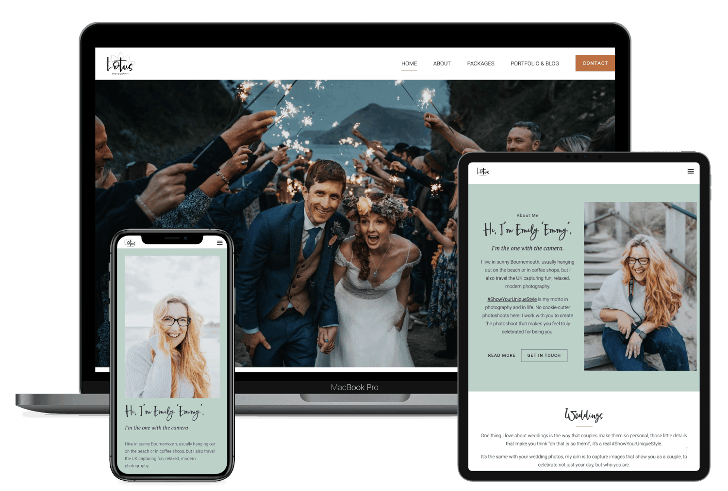
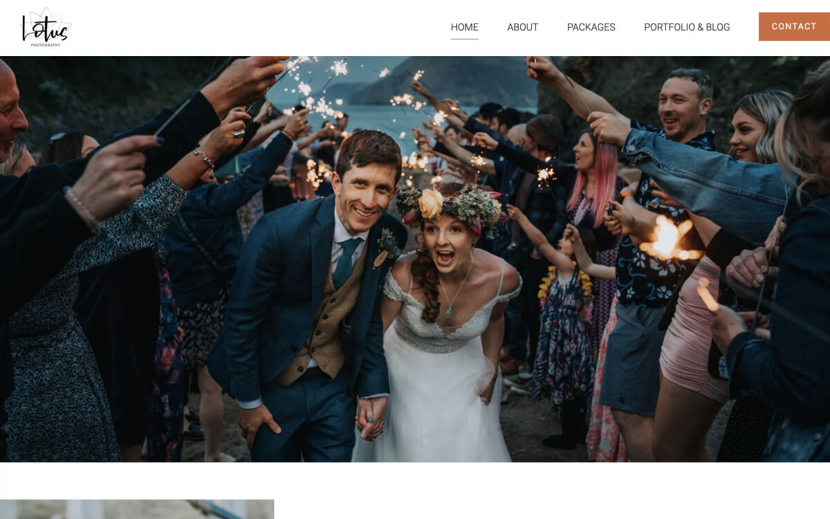
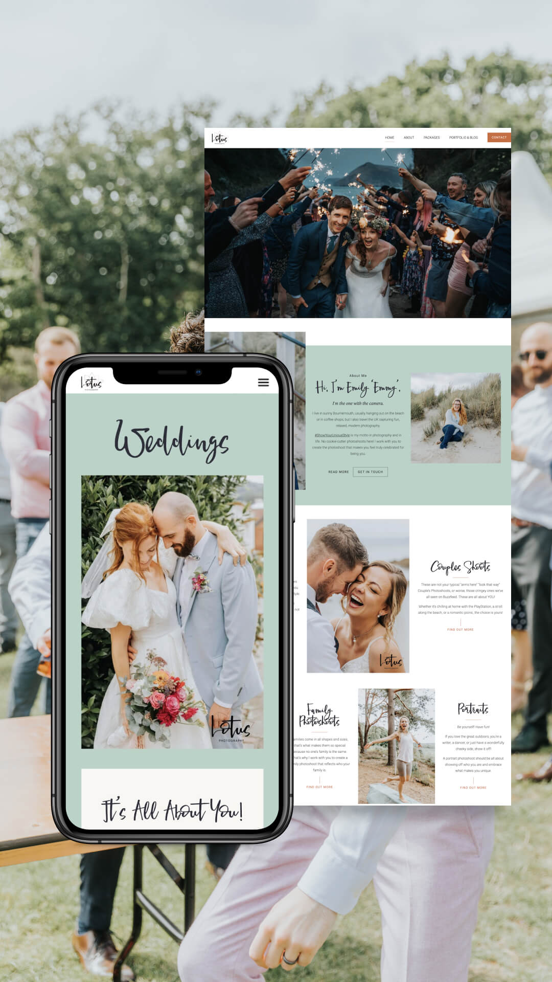
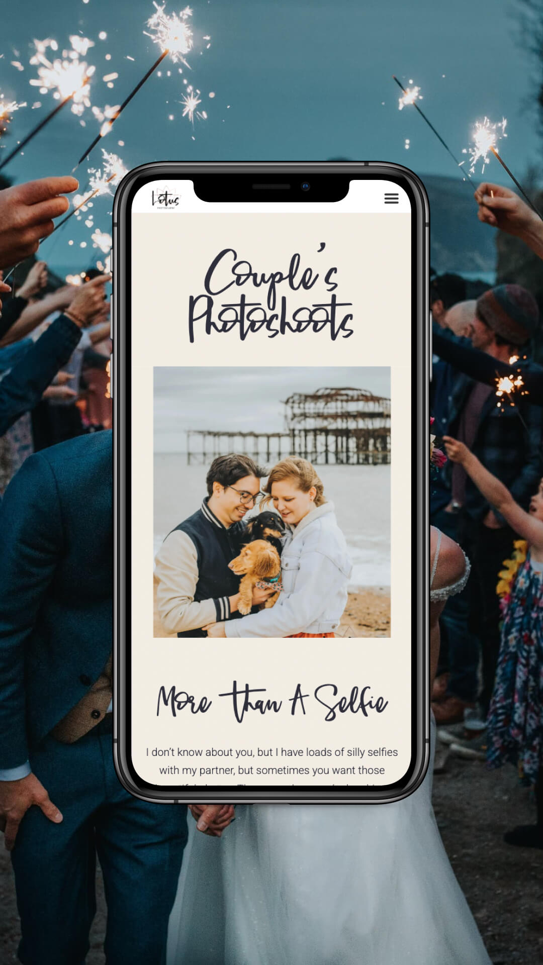
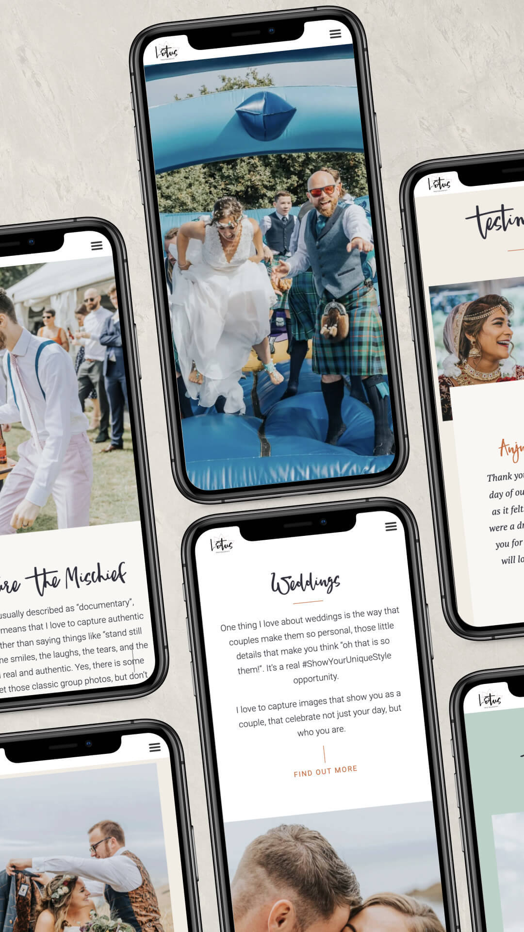
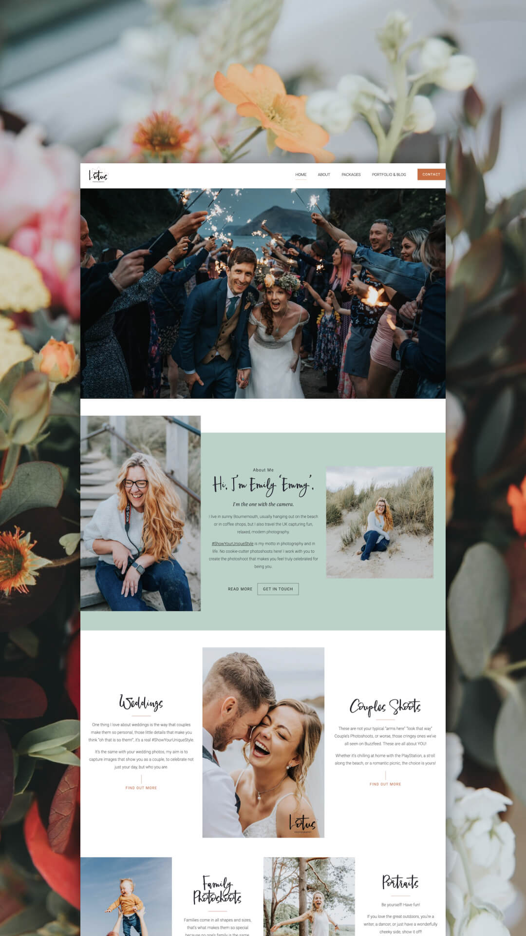
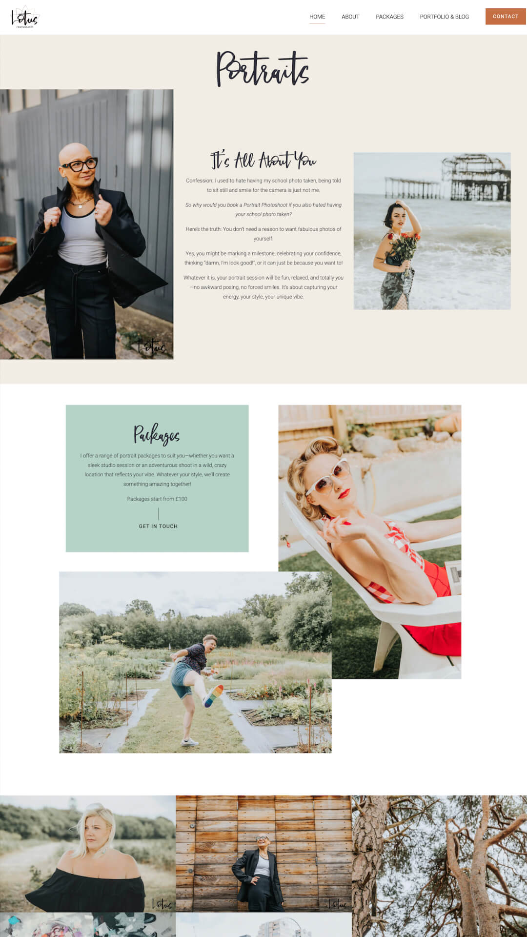
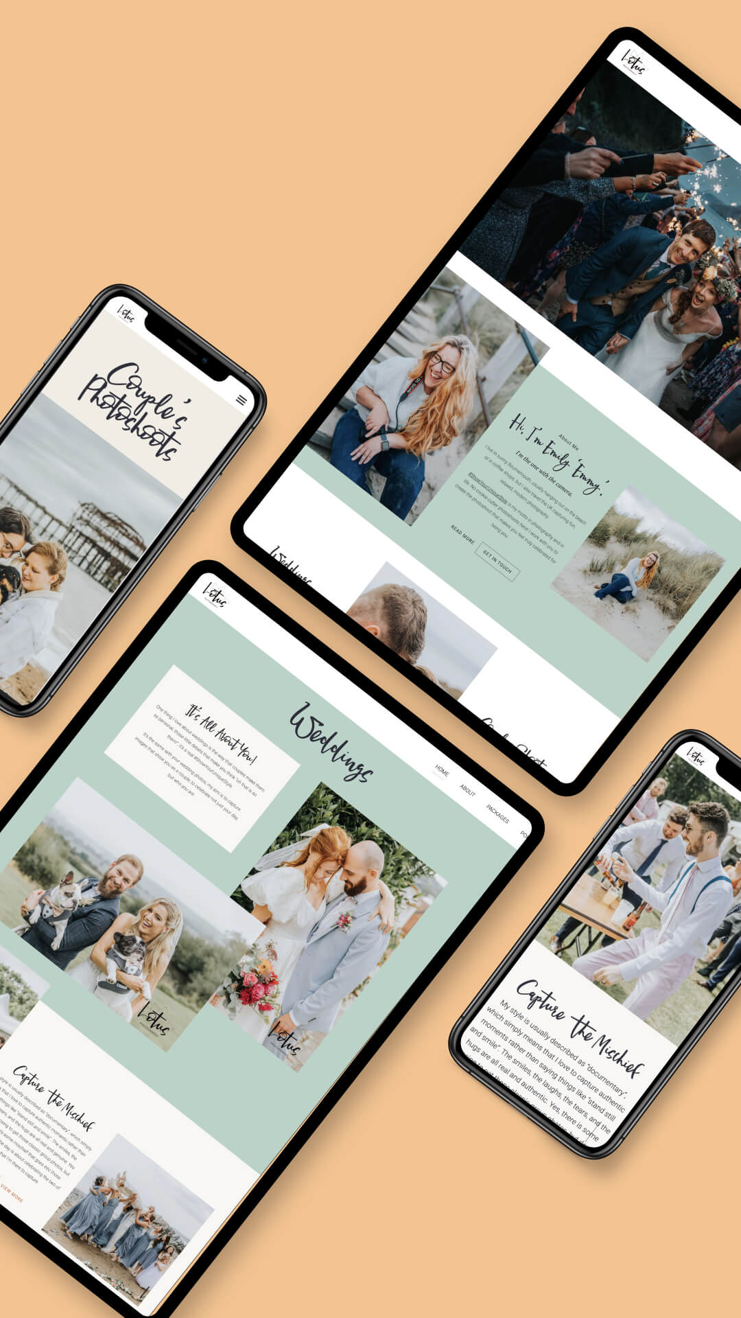
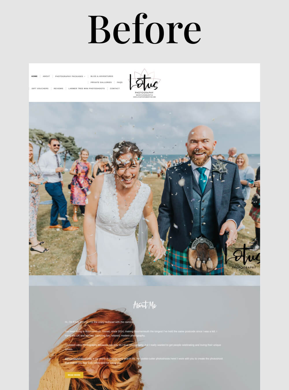
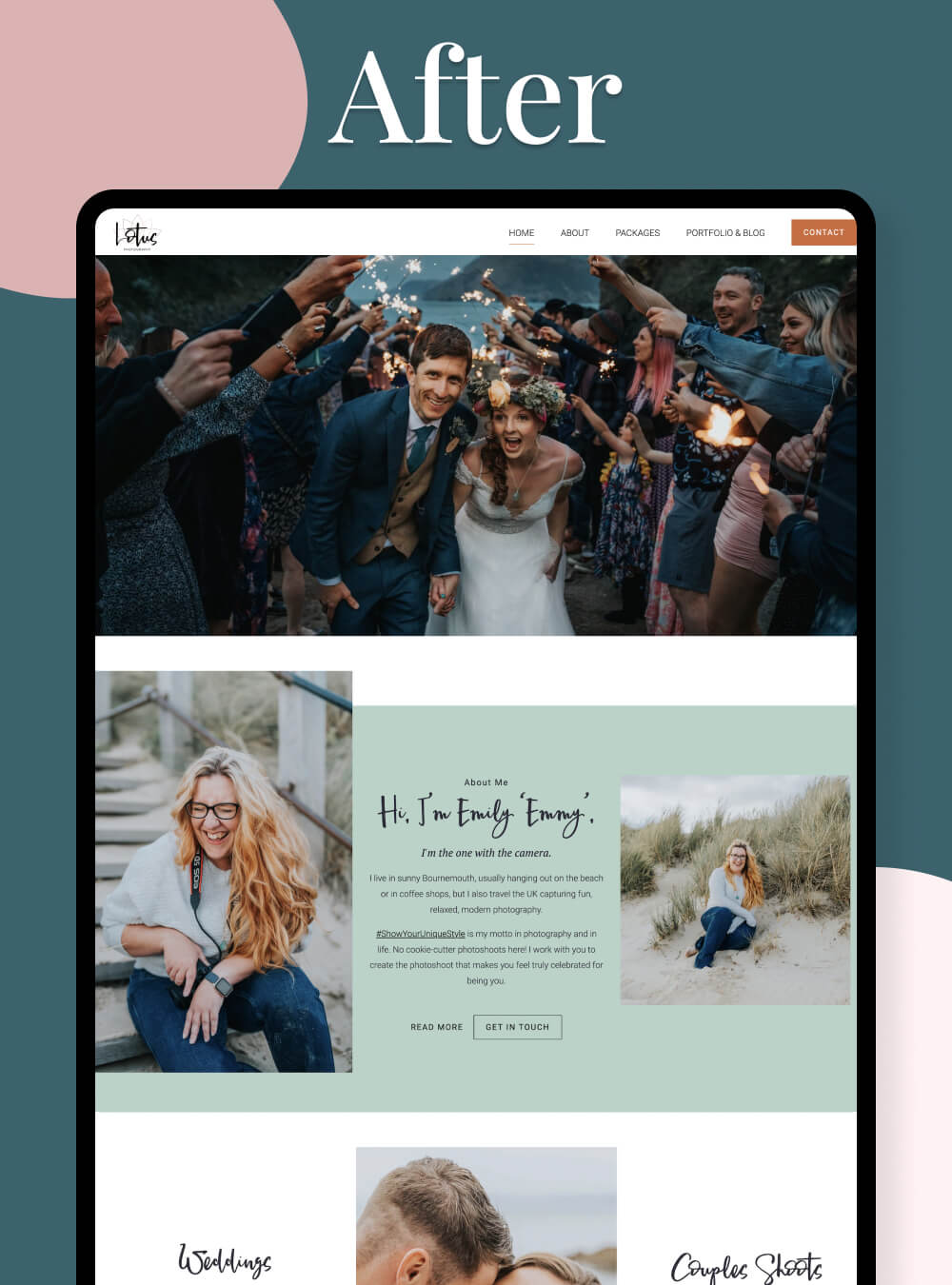
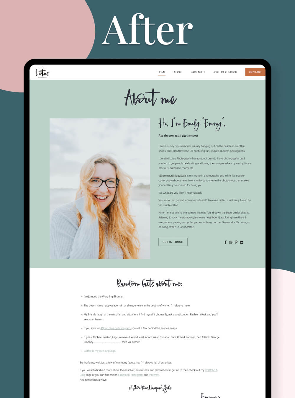
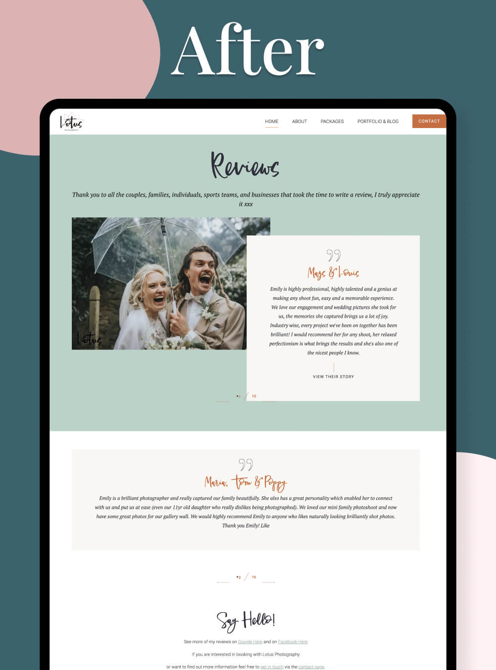
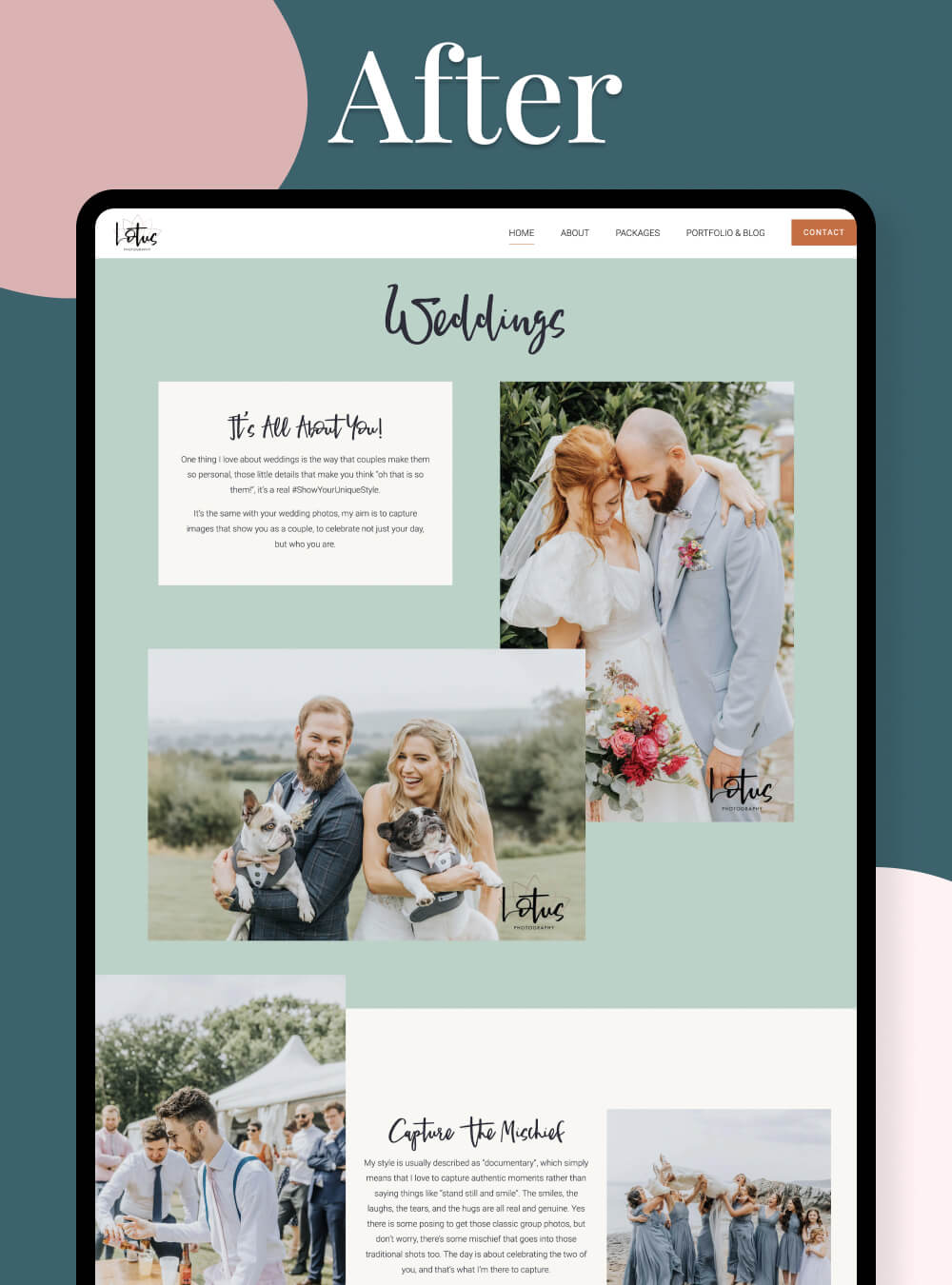
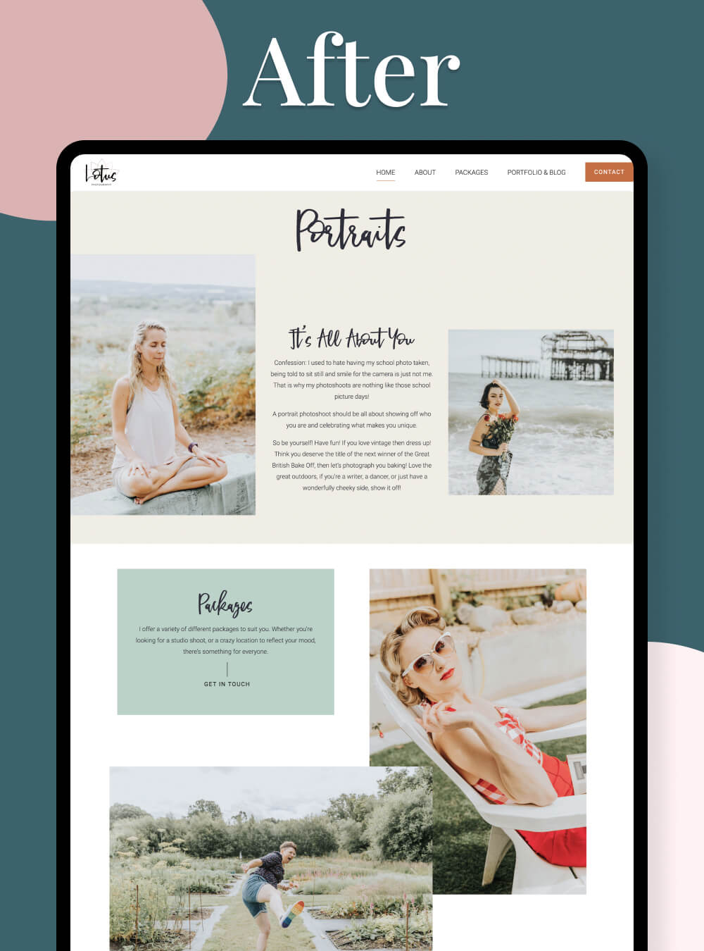
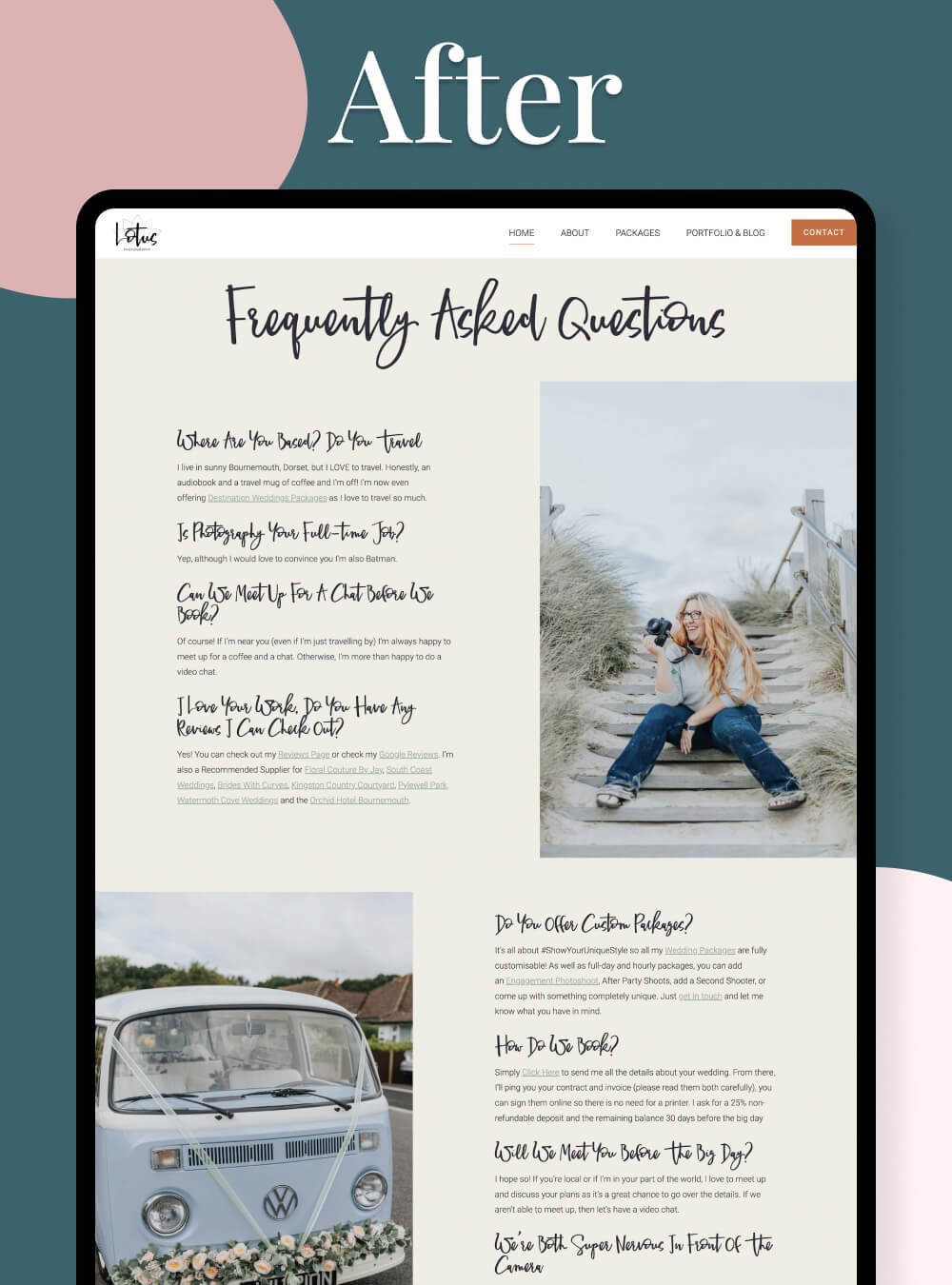
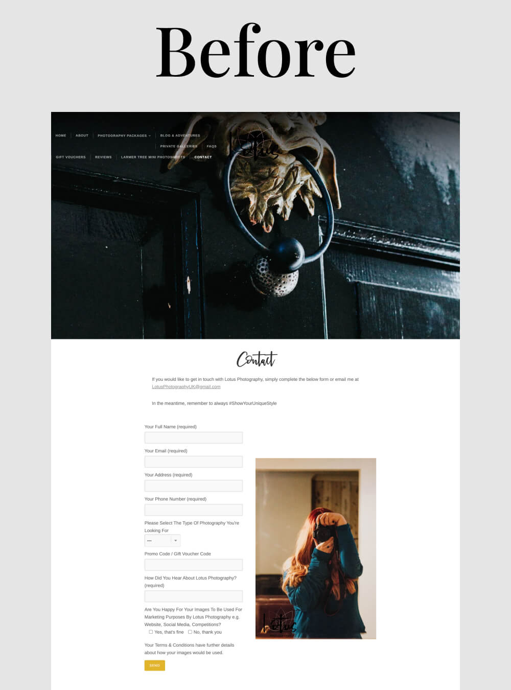
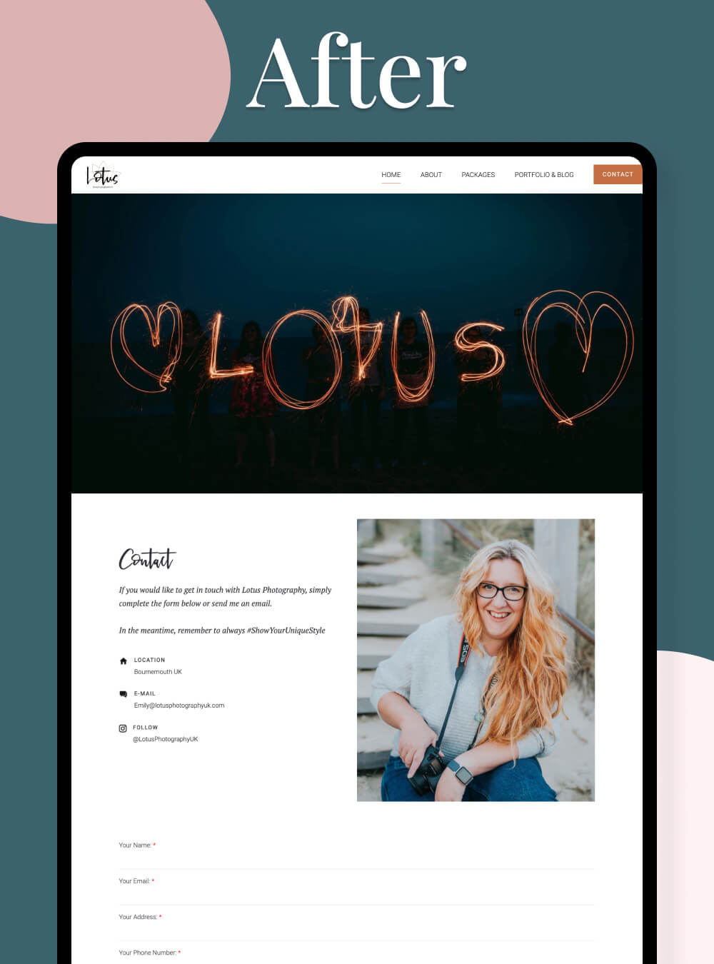
"I’m a wedding photographer and my website was just “ok”, and I asked Nikita to make it much more interesting and fun, but I had no idea what I wanted so I couldn’t give her an exact brief. It was also wedding season, my busiest time of year so I couldn’t really be on hand, I literally just gave her far too many photos and trusted her to do her thing. I’m so glad I did!
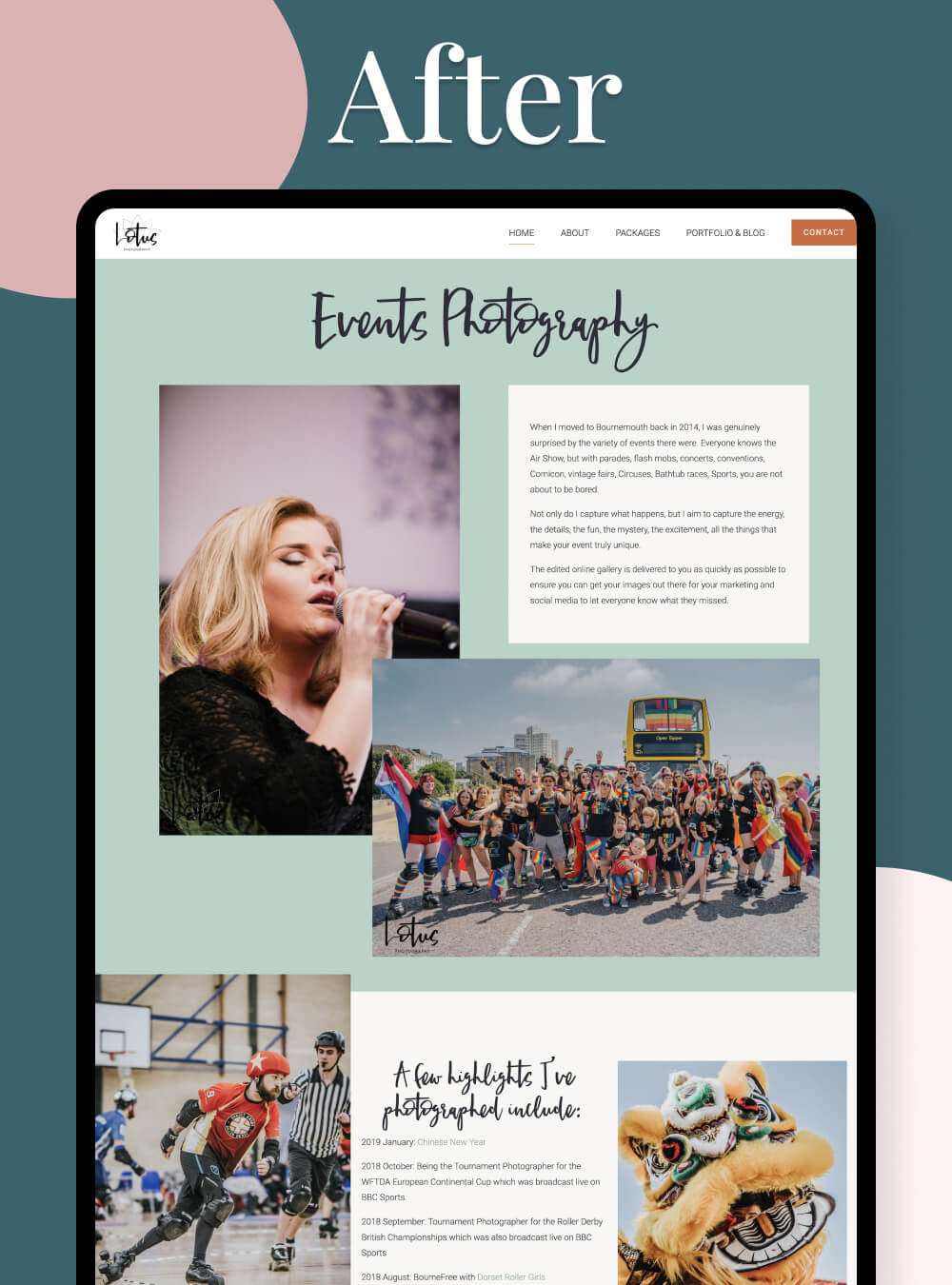
Everything from the layout, the colours, everything felt fresh and very my brand without me giving her any real guidance. She had done her research, and created something that felt so right for me. She also came up with amazing little touches that made a big difference to the flow of the website, and made it more user friendly.
Great with communication, the whole process was really simple, and she’s been fantastic answering my questions about how I edit and post things. I could ramble on, but instead I’ll close with saying I am so happy with my decision to have Nikita review my website, overhaul it, and create something so much better than I could imagine."
Emily
Lotus Photography UK