

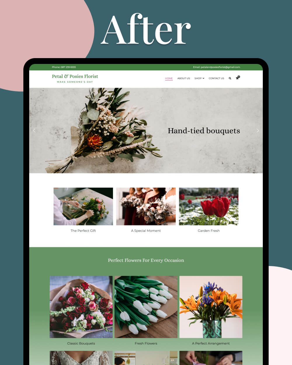
"Nikita offered a very professional and friendly service and worked hard to solve issues that we came across. Always accessible by email and completed the job on time. Nikita has a good blend of creativity and IT knowledge to create great websites."
Cora
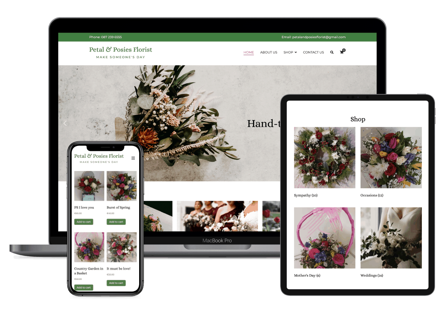
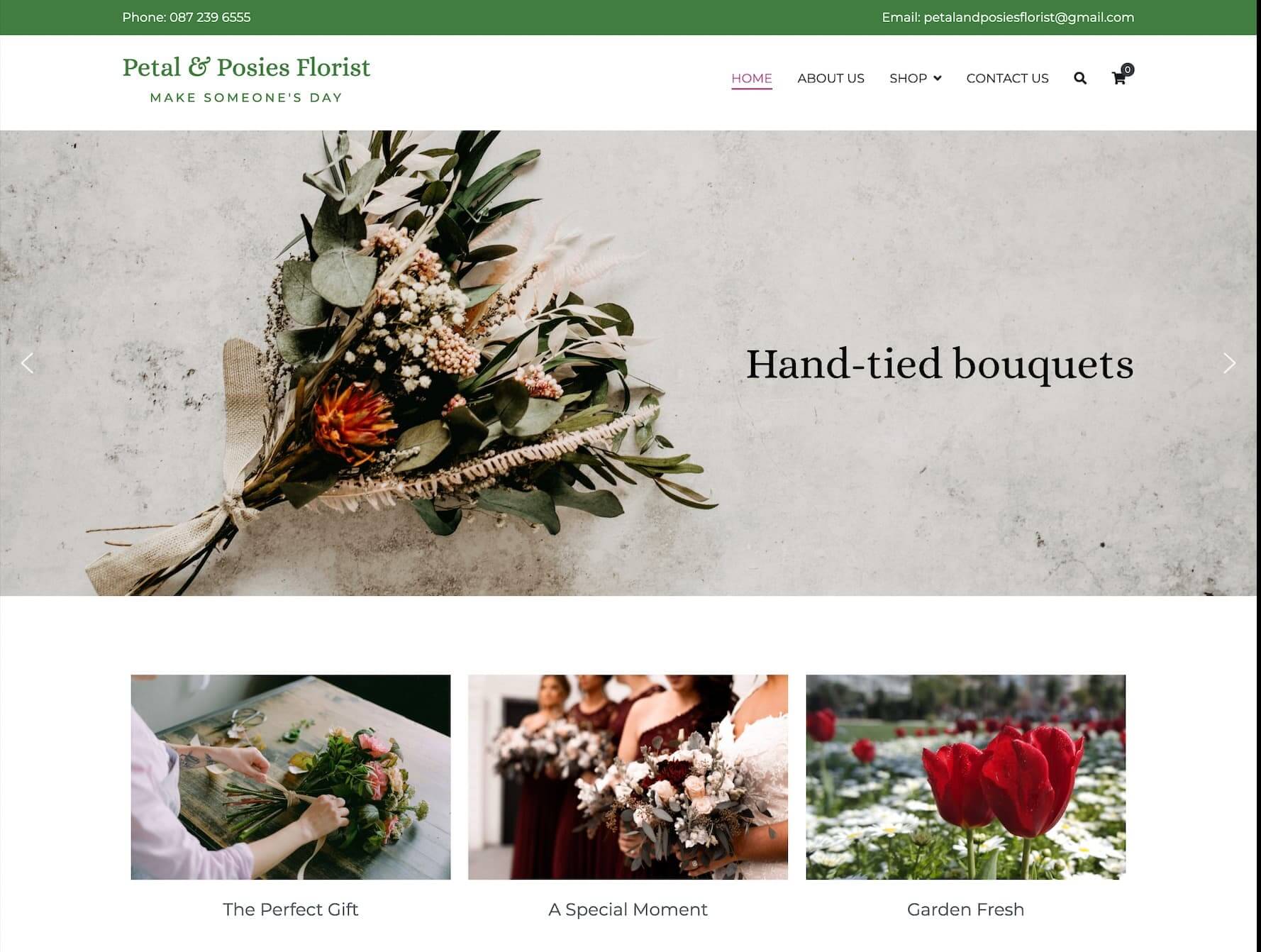
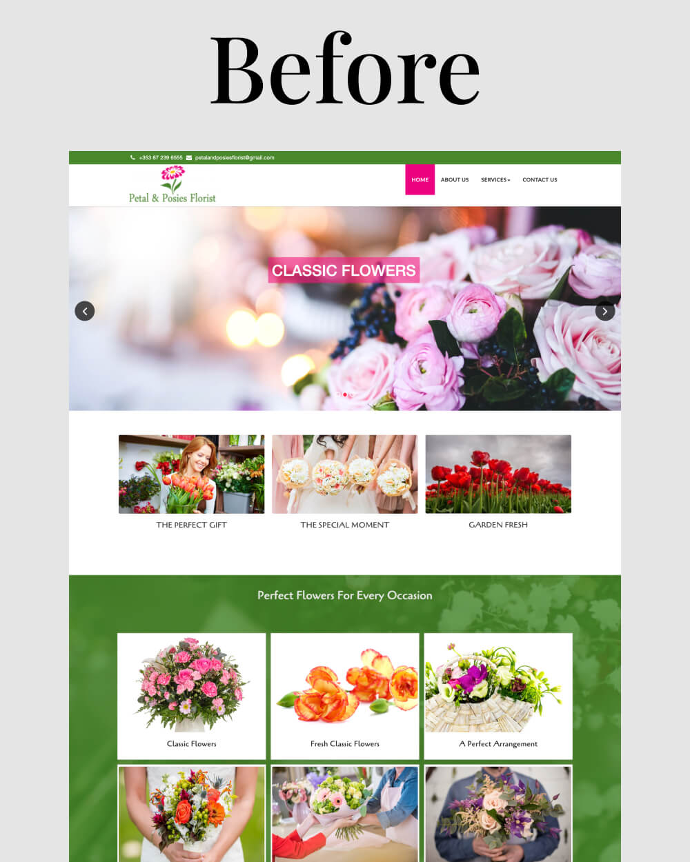
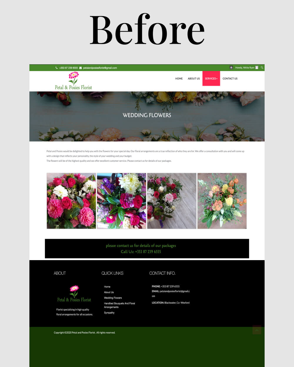
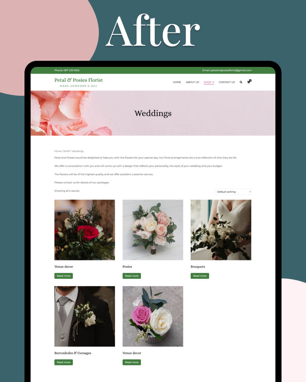
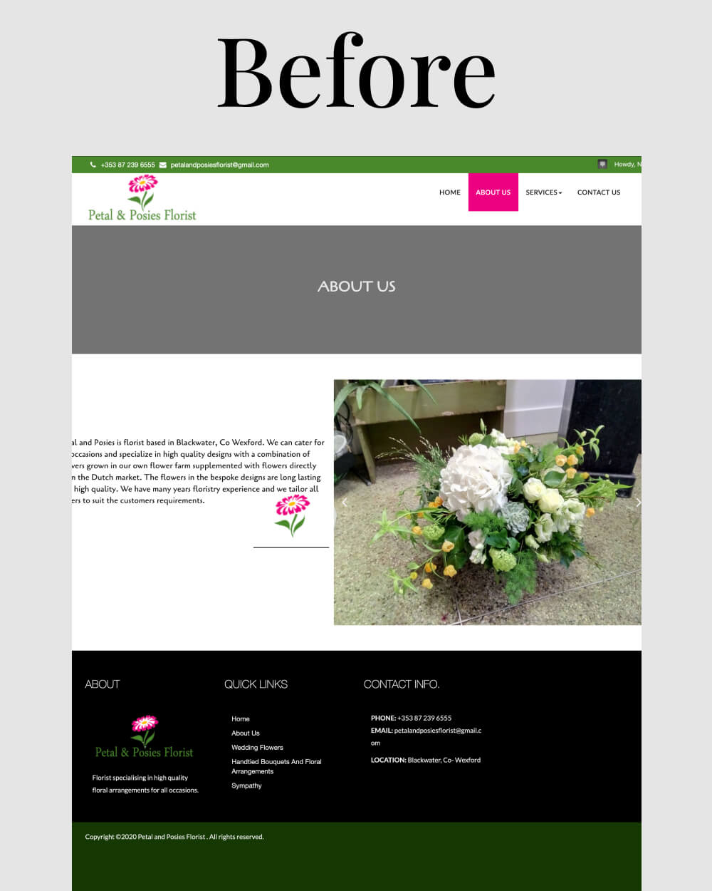
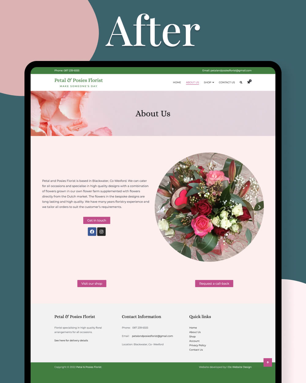
Petal and Posies Florist